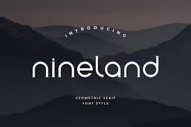
Geometric Fonts is a group of fonts that uses geometric shapes as the primary design element. The minimalist, modern look of these fonts has made them very popular with designers over the past few years.
Geometric fonts are a part of the design world since the early 20th Century, when modernist designers started experimenting with geometric shapes and simple forms. The fonts became popular during the Bauhaus Movement in Germany. Designers aimed to create simple and functional designs. The designers believed that simple shapes would allow them to create typefaces which were both attractive and easy to read.
Futura is the most famous geometric font, created by Paul Renner back in 1927. Futura, a sans-serif font with clean lines and simple shapes is popular for logos and headings. Futura’s geometric shapes and symmetrical design makes it a versatile font that can be used for a wide range of applications.
Avant Garde Gotham and Avenir are also popular geometric fonts. These typefaces all have a geometric style, but each has its own unique features. Avant Garde was designed by Herb Lubalin, in 1968. It features a combination geometric shapes with curved strokes to create a bold, expressive font. Tobias Frere Jones designed Gotham in 2000. It is a sans-serif font with a geometric style and a humanist feel. Avenir was designed by Adrian Frutiger, in 1988. It features sccbuzz, a simple, elegant geometric design.
Geometric fonts can be used for a wide range of purposes. Because they are simple to read, have a minimalist look, and are easy-to-read, geometric fonts are used for logos, headlines and branding materials. Although less common, they can be used as body text. Geometric fonts are difficult to read in body text because of their simplistic design. It is important to select the correct font size and spacing to make them easier to read.
The versatility of geometric fonts makes them a great choice. These fonts can be used for a wide range of purposes and are suitable for both print and digital media. Geometric fonts, with their minimalist and modern appearance, are frequently used in logo and branding design. Because of their simplicity, they can be used for web design. They are easy to read and load on screen.
It’s important to take into account the context of use when choosing a font. A geometric font, for example, may not work well with a traditional or formal design because it will appear too minimalistic or modern. A decorative or ornate style may clash with a minimalist geometric font.
Geometric fonts have a minimalist and modern look. They use clean lines and simple shapes. Since the early 1900s, geometric fonts have been a favorite among designers. Geometric fonts can be used for a wide range of purposes, including logos, branding materials, web design and text. It’s important when choosing a font to take into account the context and make sure that it fits. faq-blog The design should be appropriate for its intended purpose.


